Looking back at Hotwired
With news of business deals surrounding the Wired brand recently, I went back to have a look at Hotwired only to find it had been completely replaced with some sort of huckster search engine.
I started working at Wired Magazine back in 1994. I actually arrived to manage Wired’s AOL presence, but that was quickly scrapped in favor of a Web site. Hotwired was one of the Web’s first commercial sites, and we went through many iterations as new browser technologies emerged. We learned so much in such a short amount of time.
I dug into my archives and found all the home page interfaces I worked on back then. Here’s a little trip through the history of those redesigns.
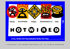
1994 - The first interface, which we launched in October of that year. This was before even Netscape had launched, so we were developing for Mosaic and a handful of browsers that I can’t even remember now. There was a big debate over whether we would require browsers that supported forms (we decided to eventually).
I particularly like how we incorporated some of the browser behavior into this interface. For example, we built this as a single image map, and images that were links showed up with a bright blue 2pt border. Since we control that, we embraced it, adding a large matching border to the image, skewing it, and overlapping the icons a bit. This was an early example of our design philosophy of engaging constraint rather than fighting it.
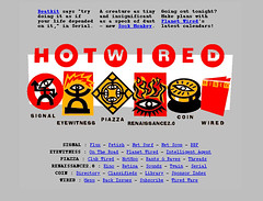
Early 1995 - We added a site map to the bottom and streamlined the image for performance issues. The blurbs at the top point directly to new content items. Tables weren’t invented yet, so we pre-formatted the text and counted out the spaces between lines to approximate columns.
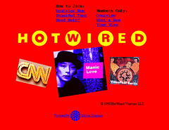
Late 1995 - Background colors! Even though it was a proprietary Netscape hack, we started using bgcolor. The text blurbs that had been at the top of the page moved down to be the focus of the page as images, causing editors responsible for sections to start battling each other. The site map moved under a link called “Overview” and the “What’s new” page had reverse chronological listings of content – something now called a “blog.”
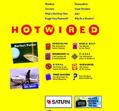
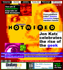
1996 - Tables! Even back then, there was a strong debate about using tables for layout. We all understood the SGML origins of HTML as a semantic language, but the benefits to design outweighed purist argument. The real nasty fighting happened over putting ads on the home page (the Saturn and pager banners at the bottom. “We wouldn’t put ads on the cover of the magazine, why would we put them here?” “But why would we want to drive traffic away from the site before they even enter?” Good arguments to this day, frankly.
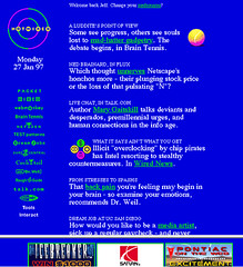
1997 - Frames! Ads on the home page were successful, so they were made stationary when the page scrolled. This front page content was written fresh every day to spotlight new content within the site. This was before RSS, of course, but really served the same purpose. I used to enjoy reading this every morning when I came in the office. I also still really like those icons stacked up on the left, too. Later, you could click a control that would “detach” that nav bar and leave it floating in a resized pop-up window using something called “Javascript”.
1998 - DHTML! This was a home page built for the Internet Explorer 4.0 beta. The items on the page floated around slowly and the background image would change over time. This was during the big PointCast craze, when everyone thought screensavers would become the new browsers. We had content constantly moving on and off the screen, evolving over time if you left it open. The concept and execution was really cool, but it was frustrating to actually use. I remember chasing after links with my mouse, try to click through to a story.
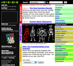
1999 - Corporate Parents. This was the last update to the Hotwired home page, as we integrated into the Lycos network and became much more focused on business metrics and pageviews. Realistic, but disappointing. This page lasted for years as Hotwired fell into neglect and Lycos chased after whatever new traffic-driving trend came along. Both Webmonkey and Wired News continued on with strong content, but Hotwired as the hub of the network slowly faded away.
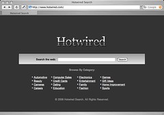
2006 - Sold by whatever international holding company now owns the property. Hotwired appears to have become a paid-click advertising vehicle leveraging whatever remnant traffic remains. An ignominious end, indeed.
I suppose it’s easy to be nostalgic for those times - and a little sad at the eventual outcome. I’d hoped that Hotwired would someday have a legacy to match the effort and passion that we all put into it, rather than become a liquid asset for a marketing-driven clearinghouse like Lycos. Thankfully, the folks over at the Internet Archive understand something of the importance of where we’ve been; the Hotwired archives can be browsed there.
But nostalgia is dangerous. It’s easy to look fondly back on the good old days while ignoring just how hard all that was. It was a time when we couldn’t fall back on experience to guide us, or much of an industry for support, or a business model, really. But it’s also a foundation for helping avoid the same mistakes again. As we hurtle through Web 2.0, it’s helpful to remember what it was like when everything was in beta.
